Bringing open data to life and making it tangible through visualisations

Which members of the Grand Council intervene the most, and with whom? Do parliamentarians work together across political divides? Are men more likely to work with men and women with women? This blog post uses data on parliamentary interventions in the Grand Council of the Canton of Thurgau to describe how visualisation can bring open data to life and make it tangible.
I asked myself the above questions when I examined the data of the Grand Council of the Canton of Thurgau as part of the Open Data course at the University of Bern. Raw data in Excel tables, with incomprehensible numbers, characters and variable names, can sometimes seem dry and lifeless. In my case, there were two such tables: One with data on the members of the Grand Council and the other with data on submitted interventions and their signatories since 2012. My task: to bring data to life, to make it visible, tangible and explorable. This is made possible by interactive visualisations that offer intuitive and entertaining access to the data and enable users to discover connections and acquire new knowledge.
Finding the right form
Every dataset contains a variety of stories, big and small. The story you want to tell determines the form the visualisation should take. Do you want to show changes over time or over space? Is the focus on numbers or on relationships? Which dimensions do I want to show and link together? Depending on the answer to these questions, a map, a Sankey diagram or a treemap is best. Websites like Datavizproject can help you get an overview of the variety of visualisation forms and choose the most appropriate one.
The questions that concerned me mainly revolved around who submits the proposals together with whom and how often. The visualisation form I chose is therefore a network visualisation, where MPs are represented by circles and joint interventions by links between MPs.
The kneading of the data
Anyone who has worked with data knows that every data set requires a certain amount of work until it has the desired shape and quality. Often the data has to be sifted and cleaned like ingredients in a bakery, then mixed and kneaded into a dough, and finally shaped into the desired form. That is exactly what happened in this case. Let us take the example of the names of MPs, which were to be used to link the two sets of data on councillors and speeches submitted. Unlike identification numbers, for example, names are not unique and unchanging. There are nicknames, double names, misspellings and name changes. All these elements found their way into my data. For example, one MP appeared under three different names (Gina Rüetschi, Regina Rüetschi and Regina Rüetschi-Fischer). In order to establish a clear link between the signature on an intervention and a parliamentarian, the names first had to be standardised.
The right code base is the key
Once the data has been cleaned and formatted, the next step is to create the visualisation. If, like me, you have little or no experience with interactive visualisations, you need help getting started. Fortunately, there are plenty on the internet, provided you know where and how to look. The tool I wanted to work with is called D3.js and consists of a Javascript framework for interactive web visualisations. Tutorials on the basics are available on YouTube , for example. But if you have a specific visualisation in mind, you quickly reach your limits with purely didactic knowledge. The answer lies in code examples. On Observable , for example, you will find hundreds of visualisations with the corresponding source code. The trick is to find the visualisation that best fits your ideas and use it as a basic structure that you can then shorten, transform and extend until your own visualisation takes shape. In my case, it took two attempts before I found the right starting point: a minimal example of a simple force-based network with a filter function.
Let yourself be surprised
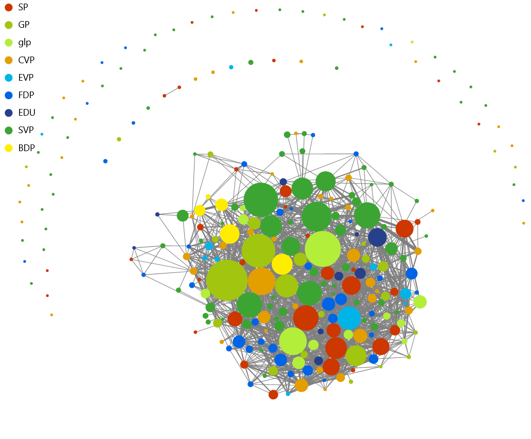
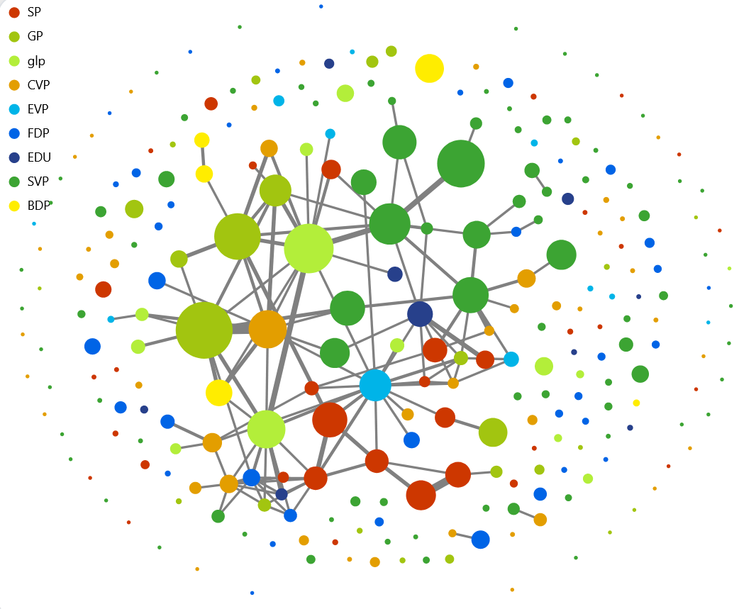
Even if you have a clear idea and the right tool, not everything always goes according to plan. Data can sometimes surprise us by going against our intuitive expectations of its content and structure. Initially, I assumed that collaboration on a particular:MP would be limited to a relatively small group of people. In the course of the visualisation, it turned out that the members of the Grand Council were much more interconnected than I had assumed. In fact, they were so interconnected that the image looked more like a ball of wool than a network (Fig. 1). It was almost impossible to draw any conclusions from this visualisation. The solution was to get back to the core of the questions I wanted to ask with the visualisation: Which Grand Council networks work together on a regular basis? To achieve this insight, I had to reduce the information content. In the final visualisation, only the links are now displayed by default if two MPs have signed at least three interventions together. The result is a clear picture of regular cooperation (Fig. 2).
Conclusions of the study
The visualisation we created allows us to explore the data and draw our own conclusions in a fun way. We can now answer the questions we asked at the beginning:
1. Which members of the Grand Council submit the most interventions and to whom?
The number of interventions submitted by a member between 2012 and 2021 tends to increase with the number of years of service since 2012. Toni Kappeler (PG) has submitted the most interventions with 51 in 10 years. Toni Kappeler (PSE) and Josef Gemperle (PDC) have collaborated the most, submitting 11 speeches in 10 years (8 of them on energy). This result is also part of the answer to the following question.
2. Is there cooperation between MPs across political boundaries?
Yes, there is very good cooperation between parties. Some MEPs, such as Elisabeth Rickenbach (EPP), even work more frequently with MEPs from other parties than with their party colleagues. However, it is precisely in the context of regular cooperation that internal party networks are created (Fig. 2).
3. Are men more likely to work with men and women with women?
Of the 264 parliamentarians who were represented in the Grand Council between 2012 and 2021, two thirds are men and one third are women. If we look at the gender of the parliamentarians, we see that the network can be divided into a part dominated by women and a part dominated by men (fig. 3).
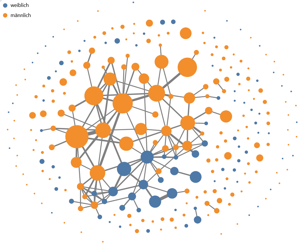 Fig. 3: Coloured network by gender
Again, part of the explanation for this division lies in the internal networks of the parties. The female-dominated network consists to a large extent of SP MPs, who at 60% have a significantly higher proportion of women than the average.
A second reason for this visible separation could lie in the topics of the interventions submitted. While interventions on transport, for example, are mainly submitted by men, interventions on social issues tend to be submitted by women.
If this has aroused your curiosity, you can discover many more stories with the help of the live visualisation.
Open government data and visualisations
I hope I have been able to show that interactive visualisations can transform dry data into lively and exciting stories. Often, the usefulness of open government datasets on obscure and supposedly uninteresting topics seems limited. But visualisations help us discover the stories contained in the data. Stories that allow us to look behind the scenes of politics, the economy and society, that create transparency, show connections and inspire new ideas. At the same time, every visualisation and application helps to identify potential problems with the data and thus improve its quality. Open public data is the basis for an informed, critical, innovative and networked society, and visualisations help to develop this potential.
This article was first published on Open Government Data in the Canton of Thurgau. On these pages you will find information on Open Government Data (OGD) in the Canton of Thurgau, events, press articles and applications as well as the OGD blog.

![]() Jurek Müller, PhD in Climate Science, works at the Institute Public Sector Transformation on the topics of Open Government Data, Linked Data, Public Value, Smart Government and Smart City. His goal is to lay the foundations for a transparent, innovative and participatory society in public administration.
Jurek Müller, PhD in Climate Science, works at the Institute Public Sector Transformation on the topics of Open Government Data, Linked Data, Public Value, Smart Government and Smart City. His goal is to lay the foundations for a transparent, innovative and participatory society in public administration.


 Contributions as RSS
 Comments as RSS
Leave a Reply
Want to join the discussion?Feel free to contribute!